Art Direction & Motion Design
Hellmann’s latest campaign, Be a BBQ Gamechanger, launched as part of their global UEFA Women’s EURO 2025™ platform Be a Gamechanger. Created by the team at Wasserman, it taps into something I really love - bringing people together through food and sport. With women’s football growing fast and BBQs being a summer staple, this campaign brings those two worlds together in a bold, celebratory way. It’s rolling out across 15+ markets this summer, and I was thrilled to be part of it.
I teamed up with the brilliant folks at Irresistible Studios to create motion graphics and a custom 3D typography treatment for the TV commercial.
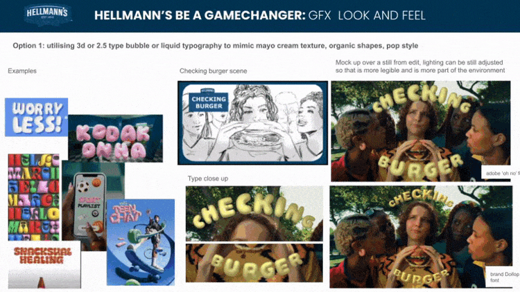
Working closely with talented director Amy Becker-Burnett and the creative team, I was tasked with designing a tongue-in-cheek ‘VAR-style’ graphic for Hellmann’s burger control room without actually using the term “VAR” or mimicking its typical broadcast look. The goal was to create something playful, bold, and instantly readable as a burger-checking visual system.
One of the standout elements was the 3D mayo-inspired text, developed as the primary callout style. After several rounds of testing and refinement, it was rolled out across the UK, Spanish, and German versions of the ad.
My role: Art Direction, Graphic & Motion Design, Animation
Client: Hellmann's
Agency: Wasserman
Created for Irresistible Studios
Client: Hellmann's
Agency: Wasserman
Created for Irresistible Studios
STYLE EXPLORATIONS
One of the key creative directions from the director was to steer well clear of anything too polished or corporate. We wanted the typography to feel playful, bold and full of personality; something that matched the tone of the spot and felt like it belonged in the world of BBQs and big summer energy.
I explored a range of type treatments, testing alternative fonts that broke away from the brand's usual typographic palette. The goal was to find something with a bit more
bounce and character, something that didn’t take itself too seriously, but still delivered
the message loud and clear.
By pushing the look with looser letterforms and bolder contrasts, we landed on a treatment that brought the right mix of energy and warmth to the scenes.
2D GRAPHICS FOR THE BURGER–CHECKING CONTROL ROOM
For the VAR-inspired ‘burger-checking’ room, I created a set of 2D graphics that brought some playful urgency to the moment a “boring burger” was spotted.
I explored a few different ideas for an attention icon: including an exclamation mark cleverly shaped like the Hellmann’s mayo bottle and tested a range of screen messaging to strike the right balance between fun and clear.
The goal? Make it feel high-stakes… but in a very mayonnaise kind of way.
3D TYPOGRAPHY TREATMENT FOR THE CALLOUT MESSAGING
For the callouts, I wanted the text to feel as rich and satisfying as the mayo itself, so I
explored fonts that could carry an inflated, almost edible look.
I started by testing a few playful typefaces that lent themselves well to a bubble-like treatment. Adobe’s ‘Ohno Softie’ stood out as a fun alternative to the brand font: round, friendly and full of personality. I mocked it up first in 2D, then brought it into Illustrator to
start shaping it into a glossy, mayo-like 3D texture.
In the end, the client opted to stick with the brand font for consistency, but with a twist:
I manually softened all the sharp corners to give it that creamy, squishy edge before transforming it into 3D. It gave the letters a subtle softness that worked beautifully
once inflated.
MOTION ITERATIONS
The motion graphics had to sit seamlessly within the beautifully crafted live-action scenes delivered by the VFX team, which meant a lot of back and forth, mockups and visual testing.
I explored different animation styles, timings, and transitions until we landed on something that felt just right.
I ran a series of animation tests, experimenting with lighting, movement speed
and material response to make sure the text remained legible and felt naturally integrated into the final scenes.
Working closely with the creative director, VFX artists, producers, and the director gave me room to try out multiple approaches and test how the graphics could interact with the filmed environment in the most natural way.

Need help with animated typography treatments for your brand videos? Get in touch hello@afoxonabox.com